Why Your Confirmation Emails Are Killing Trust Before You Say Hello
You sign up for a promising new tool, and before you've even logged in, a confirmation email lands in your inbox that looks like a ransom note. Does this sound familiar? That single message, sent before you've said a proper hello, is silently eroding the trust you just worked so hard to earn.
The First Impression You Never Get Back
Your confirmation email is often the very first piece of direct communication a new subscriber or customer receives from you. It's not just a transactional receipt; it's a handshake.
If that handshake is cold, awkward, or broken, you've already planted a seed of doubt. People judge the reliability of your entire service based on this first automated touchpoint. A poorly designed or suspicious-looking email screams "amateur" or, worse, "scam."
The Trust-Killing Checklist
Here are the most common offenders I see every single day. Check your own confirmation emails against this list.
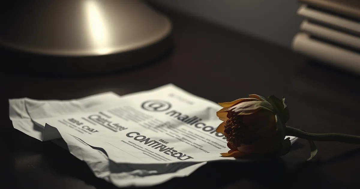
- A sketchy "from" name and address. If you're coming from
[email protected]or a name like "Notification Service," you're asking to be ignored or reported as spam. - No branding whatsoever. A plain text email with zero logo, no colors, and a generic font feels like an automated system, not a human welcome.
- Broken links or images. A missing logo or a "click here" link that leads to a 404 page is a trust disaster. Your new user immediately wonders if your product works at all.
The "No Reply" Trap
I recently signed up for a project management tool that looked incredible. The landing page was slick, the demo was smooth, and I was genuinely excited. Then came the confirmation email.
It was from [email protected]. The subject line was [System] Account Created. The body had no branding, no helpful next steps, and ended with a dismissive "Do not reply to this email." I felt like I had just been processed by a machine, not welcomed by a company. My excitement evaporated. I canceled the account within an hour.
You are telling your new customer that you don't want to hear from them. A "no reply" address on a confirmation email is the fastest way to say, "We value your money, but not your time or questions."
What A Trust-Building Email Looks Like
Your confirmation email should feel like a helpful colleague guiding someone through the front door. It doesn't need to be a work of art, but it needs to be clear, warm, and functional.
- Use a real person's name or a friendly brand name in the "from" field, like
Sarah from [Your Company]or just[Your Company Name]. - Include your logo and brand colors. This creates visual consistency and reassures the user they are in the right place.
- Provide immediate, clear value. Don't just say "Your account is confirmed." Say "Welcome! Here's your first step to getting started." Link to a getting-started guide or a key feature.
- Make the reply-to address active. Or, at the very least, include a direct link to your support team. Let them know a human is listening.
One Practical Takeaway
Before you launch your next campaign or open your next signup, send a test confirmation email to yourself. Then, pretend you are a skeptical customer who has never heard of your brand. Would you click the link? Would you feel safe entering your credit card details?
If the answer is even a little bit "no," fix it now. That first email isn't just a formality. It's the foundation of a relationship that either grows or crumbles before you ever get a chance to say hello.